02-14-2007, 01:21 AM
How about something like the order of victory? Marshal's star? Tons of diamonds are sure to catch someone's attention. (or alternatively, cause an accident)

 sticker design
|
sticker design
|

02-14-2007, 01:21 AM
How about something like the order of victory? Marshal's star? Tons of diamonds are sure to catch someone's attention. (or alternatively, cause an accident)
02-14-2007, 01:24 AM
Eric,
I would still like to see your "Collectors of the World, Unite!!" Sticker produced as well as these designs. :thumbsup :thumbsup Doc
02-14-2007, 01:52 AM
I think you could somehow nag Art to sell your stickers on the forum's cafepress store, Eric.

02-15-2007, 02:54 AM
New to the forum and have been looking at this thread a couple of days now.I realize what opinions are like and that everybody has one, so here's mine. I'm speaking here from the perspective of a graphic designer/ art director (some experience here) and not, per se, a collector.
I believe the background should be black with white type- this would be the MOST direct association with the "got milk" campaign which, after all, is the intent. I would also use the same font (type-style) as the "got milk" campaign BUT, instead of the question mark, I would manipulate that element of the font and, essentially make the question mark into a stylized hammer and sickle- must be done carefully and with restraint so that it looks at home with the rest of the type. I would do the medals in colour- no question- so they "pop" from the background. I would give the medals about a 30% overlap and arrange them, say, with the order of Lenin in the center, two star shaped medals on either side and behind that (maybe the Order of Friendship and the Order of the October Revolution), then two more "roundish" awards (maybe the Order of the Red Banner of Labour and a second-class Order of Labour Glory) behind and to the left/right of that layer, and finishing with two more red star-type awards (Order of the Red Banner and the Order of the Red Star) behind and to the left/right of that layer. This way, you will have a round shape in the center, stars on either side of that, rounds on either side of that and stars, more or less, on either side of that. Also, instead of just red , silver and gold you'll also have a couple blue shades. And more orders can be brought into the design. To finish, I'd have the forum name/address small and at the bottom in white. Strictly my opinion. 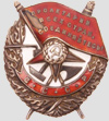
02-16-2007, 01:43 AM
Hey Greg,
Welcome to the show! Thanks for joining. I like your (informed) opinions. The black background is an idea. I might add that any darker colors tend to wash out when stuck to vehicles in the sun (such as I get down here in South Floriduh) although the dark background "Kriegsmarine" (a whole different field of collection for me) sticker I got from cafepress faded somewhat initially it is still halfway decent after a year on the back of the car. (Still no "Volksmarine, dood:thumbsup " comments yet.)
"patina imparts character" - PJS
A wise man said: 'you should not pay a premium for what you want beyond your comfort level, and always ensure there is a mutually agreeable return policy.'
02-16-2007, 01:46 AM
Greg,
WELCOME to the Forum!!! Eric, I like some of Greg's ideas. I still like the "Collectors of the World, Unite!!" design. :thumbsup :thumbsup Doc
02-16-2007, 02:01 AM
riley1965 Wrote:I still like the "Collectors of the World, Unite!!" design. DocThe hard part about that is getting all those letters on a small sticker so that they are readable from more than 2 feet. Perhaps an image of Lenin and the title 'collectors of the world....', or 'workers of the world, collect'.... the options are endless..... Perhaps another drink will make things clearer....
"patina imparts character" - PJS
A wise man said: 'you should not pay a premium for what you want beyond your comfort level, and always ensure there is a mutually agreeable return policy.'
02-17-2007, 02:43 AM
Thanks for the warm welcome! I like "Collectors of the World Unite" as well, just thought the idea was to play around with the "got milk" thing.
Does anyone have a full colour, photo-type sticker from Cafe Press? It seems to me that, from what I've seen, they print in four-colour process which means the number of colours in the design will have little impact on the cost differential. I also believe that, rather than silk-screening, they use a more modern, digital-driven production method. All this should keep cost down and give you more creative options.
02-17-2007, 02:36 PM
Greg Collins Wrote:Does anyone have a full colour, photo-type sticker from Cafe Press? . I did this from them. Came out well I think.
"patina imparts character" - PJS
A wise man said: 'you should not pay a premium for what you want beyond your comfort level, and always ensure there is a mutually agreeable return policy.' |
|
« Next Oldest | Next Newest »
|