10-01-2011, 02:17 AM (This post was last modified: 08-11-2014, 05:06 PM by CtahhR.)
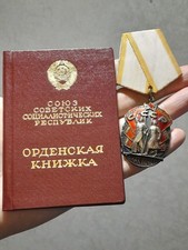
How does this order book look? I'm inclined to think it is OK. But last time I made a call on similar handwriting it was the wrong choice (order book #2 in next post).
Thanks in advance for the help! :thumbsup
order book #1 Stylistically they share some features, I think.
RedMaestro2 Wrote:Stylistically they share some features, I think.
In that they both employ printed "block" letters rather than cursive writing, yes. Other than that, they could not be more different. Look at the variations of letter size in the second post whereas nearly all the letters in the first post are basically the same size. There is precision in the first that the second lacks. It is about as close to typeface (шрифт) as one can get by hand (e.g., look at the awkward, tall and thin "д" in the second and compare it to the text in the first post).
The ink is not the official, black "India ink" or tush' in Russian, but it looks contemporary and the serial number falls within the appropriate time period. The photo may be an addition, but almost impossible to tell without accompanying photo evidence.
desantnik Wrote:The ink is not the official, black "India ink" or tush' in Russian, but it looks contemporary and the serial number falls within the appropriate time period. The photo may be an addition, but almost impossible to tell without accompanying photo evidence.
Thanks P.
If you need better pictures or enlargements particular, tell me no problems.